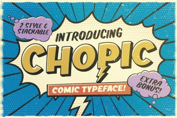
Chopic: A Bold Comic Display Font for Digital Branding
It started with a hero section that felt… safe. Too safe. I was refining the homepage for a creative coaching client — warm tones, clean layout, strong value proposition — but the headline just blended in. I swapped in Chopic, typed “Your Creative Confidence Starts Here”, and suddenly the whole section leaned forward. Not louder — bolder. Playful, yes, but with unmistakable intention. That’s when I knew this wasn’t just another fun font. It was a digital tone-setter.
What Makes Chopic Stand Out on Screen
Chopic is a premium display font built for impact — not subtlety. Its comic-inspired energy comes through in thick, confident strokes, slightly exaggerated curves, and generous spacing that breathes even at smaller sizes. Think of it as the friendly, expressive voice you’d want introducing your brand on a landing page or anchoring a product banner. It’s not trying to be neutral. It’s designed to say, “Hey — look here first.” As a web designer, I appreciate how its visual personality translates directly into emotional resonance: approachable, human, creatively unapologetic.
Real-World Testing Across Devices and Layouts
I tested Chopic across three real projects: a boutique online store’s seasonal campaign banner, a course sales page headline + CTA button combo, and a portfolio site’s “Work” section header. On desktop, it held its own over textured image backgrounds — the contrast and weight ensured legibility without needing heavy drop shadows. On mobile? Surprisingly resilient. At 32px on iOS Safari, it remained crisp and readable, especially against light or solid-color backgrounds. Where it truly shined was in responsive hero sections: shrinking gracefully from 64px on large screens down to 40px on tablets, then 32px on phones — all while keeping its charm intact. No pixelation, no awkward kerning collapse. Just consistent, joyful presence.
Where Chopic Excels (and Where to Pause)
Use Chopic where attention and attitude matter most:
- Hero headlines — instantly signals creative energy and sets brand voice
- Section headers — breaks up content rhythm and adds visual punctuation
- CTA buttons — especially short action phrases like “Start Now” or “Grab Your Spot”
- Logo text or wordmarks — when paired with a simple sans serif for balance
- Digital ads & social banners — stops the scroll with personality
But let’s be practical: Chopic isn’t built for body copy, navigation menus, form labels, or dense dashboard interfaces. Its decorative nature means low contrast in small sizes or tight line-heights can hurt readability — especially for users relying on screen readers or zoomed-in views. I wouldn’t use it below 24px for UI text, and never for anything requiring high accessibility compliance without careful testing.
Smart Pairing for Professional Digital Design
The secret to making Chopic feel intentional — not chaotic — is thoughtful pairing. In every project, I paired it with a clean, highly legible sans serif: Inter for body copy, Manrope for subheads, and sometimes a subtle serif like Lora for editorial-style testimonials. This creates clear hierarchy — Chopic draws the eye, then the supporting type delivers clarity and trust. For logo use, I’ve successfully paired it with geometric sans fonts like Montserrat or minimalist serifs like Playfair Display — letting Chopic carry the expression while the secondary font grounds the identity. Bonus: because it’s PUA encoded, accessing alternates and stylistic ligatures is seamless in modern design tools and CSS via @font-face declarations.
Practical Considerations Before You Deploy
Before adding Chopic to your next site or client project, check three things: First, confirm it includes web-optimized formats — WOFF2 is ideal for speed and compatibility. Second, verify commercial licensing covers web embedding, especially if you’re building templates, SaaS dashboards, or client sites where the font will be served live. Third, test multilingual support if your audience spans languages beyond basic Latin — some display fonts skimp on extended character sets. While Chopic handles English beautifully, always preview accented characters and punctuation in context. And remember: great typography supports UX, not overrides it. Let Chopic energize your message — then step back and let your content do the rest.